London · 3.72m transactions · 1995–2026
Gail's vs Greggs
What two bakery chains know about London house prices — and what it takes to work out whether they know anything at all.
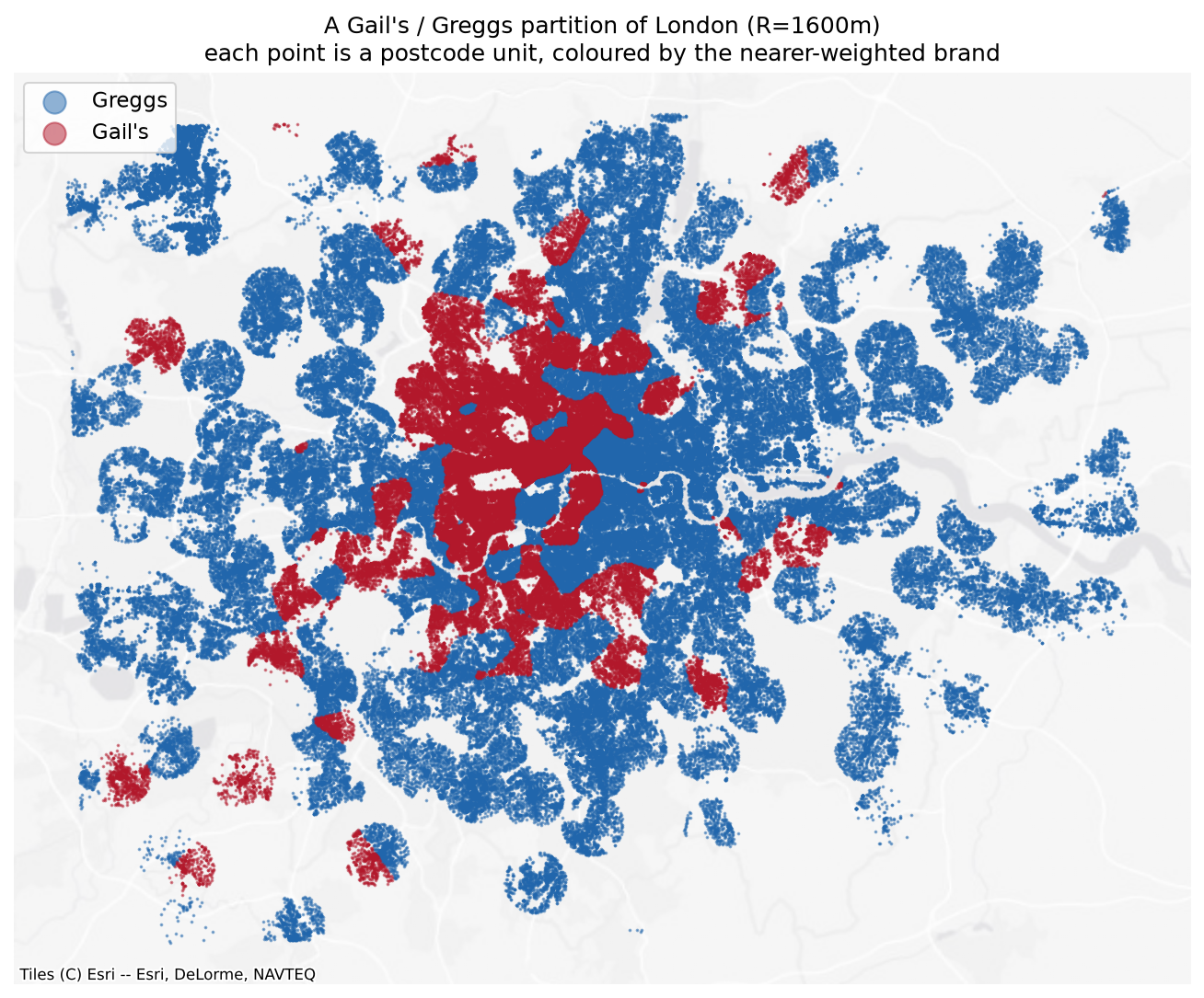
of a 4,449-parameter neighbourhood model, recovered by two numbers derived from shop coordinates alone.
still added on top of deprivation and distance-to-centre together — 27% of what those two leave unexplained.
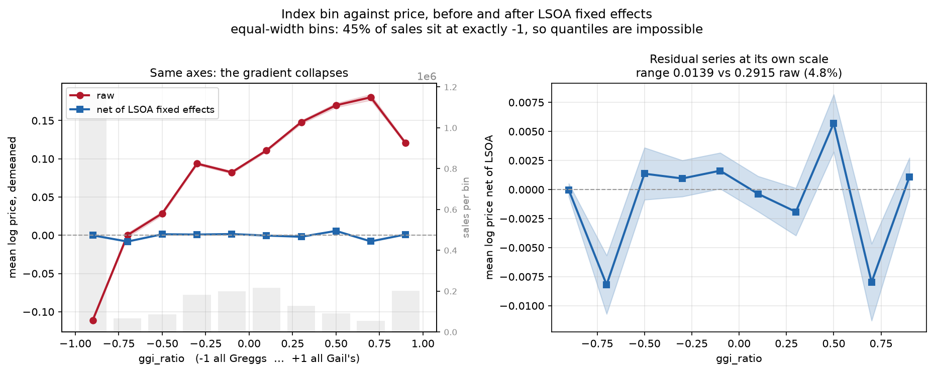
price gap between a Gail's and a Greggs catchment within one neighbourhood. Real, and twenty times smaller than the raw gap.
The question, and the trap in it
The obvious question — does a Gail's nearby raise house prices? — is unanswerable with this data, and would be the wrong question even if it weren't.
Gail's is a private-equity-backed chain that sites deliberately into affluent, gentrifying, high-footfall catchments. Greggs sites onto high streets and transport nodes across the whole income distribution. Any positive coefficient is reverse causality by construction.
So the project asks something else: how good a measurement instrument is the bakery map? If Gail's picks its sites well, then the distribution of two chains ought to encode a great deal about which parts of London are desirable — not because the shops did anything, but because somebody with commercial incentives already did the analysis and voted with their capital.
That reframing changes what counts as success. A proxy is supposed to read a pre-existing signal, not create one. So the null result below isn't a failed hypothesis — it's a property the instrument needs to have.
Method
Shop locations come from OpenStreetMap (Overpass) merged with All The Places, reconciled into a slowly-changing dimension so that openings and closures accumulate as an immutable event log rather than overwriting a table. The current estate is 136 Gail's and 300 Greggs inside Greater London.
Prices are HM Land Registry Price Paid, category A, Greater London, 1995 to July 2026 — 3,724,260 transactions. Geography is the ONS Postcode Directory, August 2026, which geocodes 99.94% of those sales to a British National Grid centroid and a 2011 LSOA. Retaining the 200,755 terminated postcodes is what makes the 1990s join work: the match rate never drops below 99.89% in any year back to 1995.
The accessibility index
Accessibility uses a bisquare kernel with compact support, computed per postcode unit in EPSG:27700 so distances are straight metres:
Raw inverse-square was rejected: it diverges as d → 0, and a hard cap on top of it puts visible rings at radius R on the map. Bisquare decays smoothly to exactly zero, is bounded at the origin, and needs only radius queries. Two quantities come out of it:
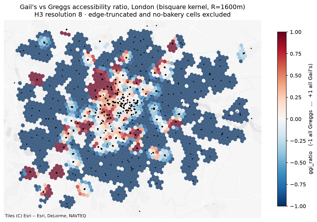
- ggi_ratio = (Agails − Agreggs) / (Agails + Agreggs) — which chain
- total_access = Agails + Agreggs — how much bakery at all, which is essentially high-street-ness
Where both are zero the ratio is undefined, so those postcodes carry an explicit no_bakery_nearby flag rather than an epsilon. Postcodes within one bandwidth of the harvest boundary carry an edge_truncated flag, since their catchments are cut off by the edge of the query box rather than by an absence of shops.
Registration lag turned out to be far worse than documented — the incomplete tail runs about nine months, not the two the guidance suggests. July 2026 holds 28% of a normal month's sales. Rather than a fixed window, each month is scored against the median of months 12–24 back and carries a completeness ratio; the sample keeps months at ≥ 0.90.
Result 1The causal reading is a null, and five tests say so
Four specifications, each designed to break the one before. Dependent variable is log(price); standard errors clustered at LSOA; n = 2,388,494.
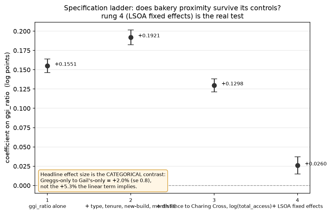
The effect size is +2.0%, not +5.3%
The ratio is not a smooth gradient. 45% of sales sit at exactly −1 (Greggs-only catchment) and 6% at exactly +1, with a thin middle — so a linear coefficient estimates a contrast between lumps while presenting as a slope. Entered as categories instead, with Greggs-only as the reference:
| Catchment | Coefficient | se | n |
|---|---|---|---|
| Greggs only | 0 (ref) | — | 1,074,473 |
| Mixed | +0.0102 | 0.0044 | 1,174,665 |
| Gail's only | +0.0201 | 0.0082 | 139,356 |
The linear form implies a Greggs-to-Gail's gap of +5.3%. The honest figure is +2.0% — the linear specification overstates it by a factor of 2.6 because it stretches a scale whose mass sits at both endpoints.
The pre-dating test settles the causal reading
Take today's bakery map and use it to predict sales from a decade ago, when most of the current Gail's estate did not exist.
- 2015 sales: +0.0187 (se 0.0081, n = 62,154)
- 2025 sales: +0.0258 (se 0.0080, n = 61,410)
The difference is t = 0.63. Today's Gail's map predicts 2015 prices about as well as it predicts 2025 prices. Shops that opened after 2015 cannot have caused a price surface that already existed — which is exactly what a proxy reading a stable, pre-existing property of a place should look like.
What would have falsified the instrument, and what happened
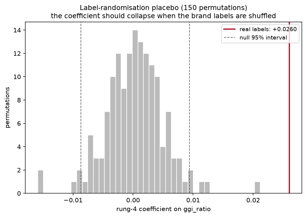
- A broken pipeline. Label-shuffle placebo — the coefficient collapsed to noise on every one of 150 draws. Survived.
- A radial gradient in disguise. Added to distance-from-Charing-Cross, the bakery terms moved 38.5% → 60.1%. Survived.
- Redundant against conventional variables. Added on top of deprivation and distance, 63.5% → 73.1%. Survived.
- Merely finer-grained than its competitors. Aggregated to LSOA means, the increment grew rather than shrank. Survived.
- Just "how many shops are nearby". Against all 47,902 OSM retail POIs, the bakery terms still added 16.9 points at matched parameter budget. Survived.
The only casualty was the causal reading — a claim the project never made.
Result 2What the ratio was hiding
A ratio forces Greggs to be Gail's mirror image, so it cannot say whether Greggs proximity is good or bad on its own. Entering the two brands separately — a presence indicator plus an intensity term each, since 45% of catchments contain no Gail's — splits two effects that were cancelling.
Rung 3 specification, all terms jointly estimated. The same pattern holds at rung 2.
Two things fall out. First, the mechanism you'd guess — "a Greggs means a working high street, and high streets are worth being near" — is half right: the high-street effect is real but it lives in the density term, and Greggs itself is negative even before density is controlled. Second, and more interesting: Gail's presence is a marker, not a dose. One Gail's tells you almost everything; five tell you barely more. That is what you would expect of a siting decision that is itself the signal.
Result 3How much of a neighbourhood model can two bakeries replace?
The test: hold property controls and sale-month fixed effects constant, then ask what share of the gap between no location information and 4,449 LSOA fixed effects each cheap location measure recovers. Reported out of sample, on a 477,492-sale holdout fitted from 1,911,001.
| Specification | Params | R² | Share |
|---|---|---|---|
| Base controls only — floor | 0 | 0.5698 | 0.0% |
| + LSOA fixed effects — ceiling | 4,449 | 0.8352 | 100.0% |
| + distance to nearest station | 1 | 0.5907 | 7.9% |
| + IMD 2019 rank | 1 | 0.6189 | 18.5% |
| + generic retail access (47,902 POIs) | 1 | 0.6518 | 30.9% |
| + distance to Charing Cross | 1 | 0.6720 | 38.5% |
| + bakery ratio and total access | 2 | 0.6878 | 44.5% |
| + bakery terms, brands separate | 4 | 0.7095 | 52.6% |
| + IMD and distance | 2 | 0.7384 | 63.5% |
| + all four conventional | 4 | 0.7467 | 66.6% |
| + IMD, distance and bakery | 8 | 0.7638 | 73.1% |
| + all conventional and bakery | 10 | 0.7663 | 74.0% |
"All four conventional" = IMD rank, distance to Charing Cross, station distance, generic retail access. In-sample and out-of-sample shares agree to within 0.4 points on every row; the 4,449-parameter ceiling moves only 0.8359 → 0.8352, so it is barely overfitting at ~430 sales per LSOA.
Reading the table honestly
The headline deflates, and then stops deflating. "44.5% of a 4,449-parameter model with two numbers" sounds remarkable until you notice that distance to Charing Cross alone gets 38.5%. The number that survives scrutiny is the increment: adding the bakery terms on top of IMD and distance moves 63.5% → 73.1%, closing 27% of everything those two leave unexplained. That comparison has the obvious alternatives already in the model, so there is nothing left to deflate it against.
Two bakery chains beat the official deprivation index by roughly 3× — 44.5% against 18.5%. That asymmetry cuts both ways and the write-up says so: IMD's domains include income and employment deprivation, so it is a survey-derived measure of socioeconomic status, partly built from the same forces that set prices. It is not a neutral competitor, and it is not built to predict prices. That makes its weak showing less surprising and the bakery index's showing more so, since the latter uses nothing but coordinates.
Station distance is a genuine negative result. 7.9% alone, and +0.1 points on top of IMD and distance. London is dense enough with stations — median nearest 629 m — that the variable barely discriminates. OpenStreetMap was used rather than TfL open data, because TfL omits National Rail suburban stations, which in outer London are often the only station a postcode has; using TfL would have understated accessibility exactly where the bakery index is weakest, flattering it.
Is Gail's vs Greggs actually the best pair?
The same machinery, six retail pairs, identical sample and parameter budget, ranked by increment over the full conventional stack.
| Pair | Outlets | Alone | Increment |
|---|---|---|---|
| Gail's / Greggs | 105 / 225 | 51.0% | +6.7 |
| Waitrose / Iceland | 141 / 131 | 40.3% | +6.0 |
| Pret / Greggs | 316 / 225 | 36.4% | +3.1 |
| M&S Food / Poundland | 151 / 76 | 30.1% | +2.7 |
| Costa / Pret | 400 / 316 | 35.8% | +2.6 |
| Boots / Superdrug | 298 / 120 | 16.1% | +2.3 |
Harvested from OpenStreetMap only, so the Gail's/Greggs row differs from the main analysis, which additionally merges All The Places and applies a curated duplicate list. Internally consistent within this table.
It isn't outlet count
The obvious alternative explanation is resolution: a pair with 716 outlets has a finer-grained index than one with 330, regardless of how sharply the brands sort. The ranking already runs against that — Gail's/Greggs has the second-smallest estate and ranks first; Costa/Pret has the largest and ranks fifth. Thinning Costa/Pret down to the incumbent's exact counts over three seeds costs it 0.2 points of increment (+2.6 → +2.4). At identical outlet counts, the gap is roughly threefold.
Two qualifications
Waitrose/Iceland at +6.0 against +6.7 is not a commanding lead — on a different sample split I would not bet on the ordering between those two, and the gap to third place is far larger than the gap between first and second. The defensible claim is a clear top pair of two, with Gail's/Greggs at its head.
More importantly, the field was selected on the dimension it is scored on. These six were chosen because they are plausibly socially contrastive, and Gail's/Greggs was chosen first precisely because the contrast is conspicuous. Winning a field selected for the property being ranked is weaker evidence than winning a random one. The honest claim is: best of six deliberately contrastive pairs, not demonstrably optimal among all possible pairs.
Limitations
No floor area
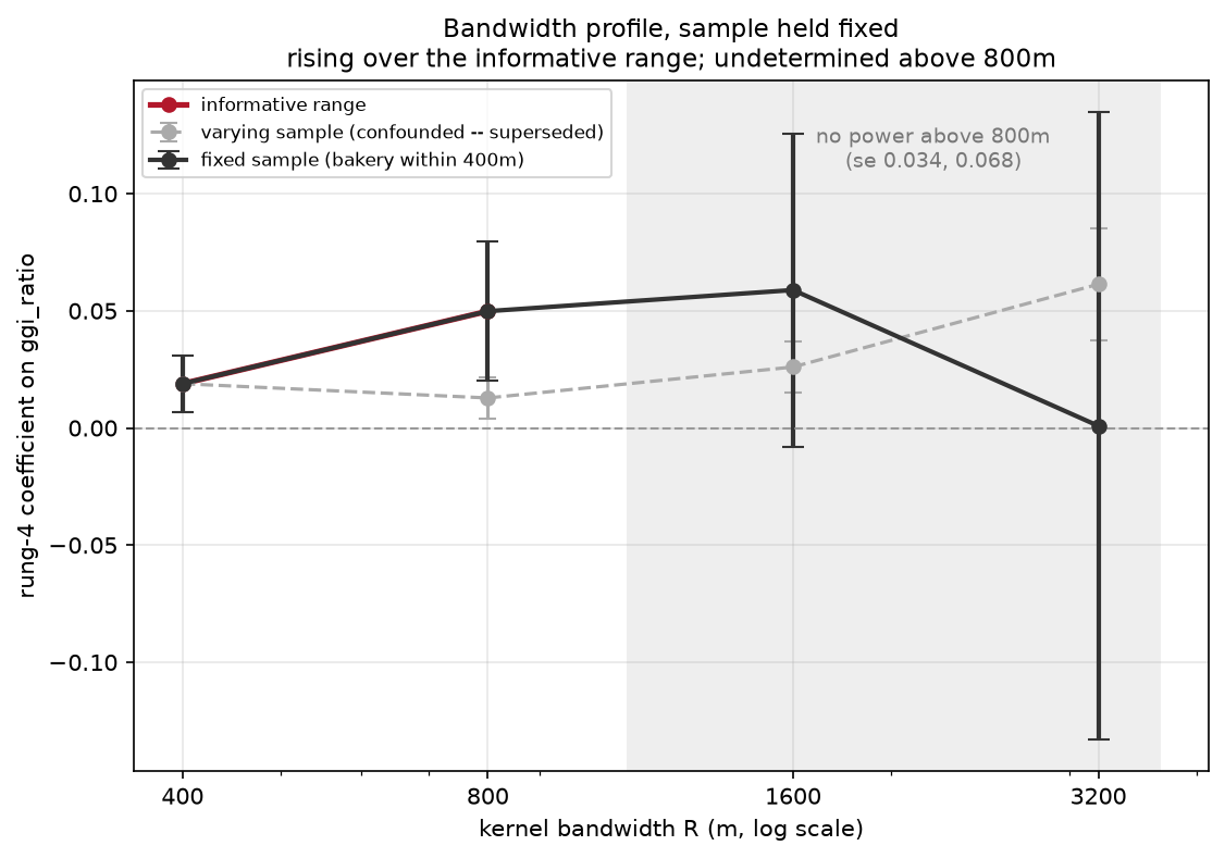
Price Paid carries only property type, tenure and new-build. Floor area lives in EPC data, which is not ingested — so rungs 1 through 3 have weak property controls and their coefficients are inflated by an unknown amount. Rung 4 is the exception: LSOA fixed effects compare houses within the same small neighbourhood, which holds much of the missing variation roughly constant. Treat rung 4, the placebo and the bandwidth profile as the real output.
The bandwidth question is undetermined, not answered
Across varying samples the coefficient rises fourfold with radius, which looks like evidence the index becomes a central-London gradient at wide bandwidths. It isn't — that comparison is confounded by sample composition, since no_bakery_nearby runs from 82% of sales at 400 m to 0.7% at 3,200 m.
Descriptive, not causal
Nothing here identifies a causal effect of anything on anything. The claim is that a bakery map is an informative measurement of location quality, not that bakeries produce it.
Current shops, historical sales
The index uses the 2026 estate against sales back to 1995. That anachronism is real, and the pre-dating test measures its consequence directly rather than apologising for it — the index working equally well in 2015 is the evidence for reverse causality, not a defect to be corrected.
Parameter budget matters more than first claimed
Against generic retail at one parameter the bakery terms add 25.5 points; at a matched four-parameter budget they add 16.9. The conclusion holds in both cases, but the magnitude is budget-dependent and asserting invariance would have been wrong.
The picture underneath
Build notes
The pipeline is reproducible from a clean checkout and runs under a 512 MB DuckDB ceiling on an 8 GB machine — a constraint that shaped the design more than expected, and cost three OOM kills before the Price Paid backfill was staged year-by-year and made resumable.
Ingest
Content-hashed idempotent downloads with HTTP conditional requests; per-source watermarks; add/change/delete upsert against the monthly Land Registry change file; transactional runs with a write gate.
Entity resolution
Cross-source spatial matching at 50 m, stable-id matching taking precedence, and explicit split/merge rules for when one row is claimed by two observations.
Data quality
Two-sided count gates that refuse the run; alerting on id-match-rate drops rather than on exceptions; repudiable runs, since a bad run can commit.
Geospatial
EPSG:27700 throughout, BallTree radius queries, bisquare kernels at four bandwidths, H3 hexbinning, GeoPandas and contextily.
Econometrics
pyfixest for high-dimensional fixed effects, LSOA-clustered errors, Frisch–Waugh–Lovell, permutation inference, nested model comparison, held-out validation.
Stack
Python 3.12, DuckDB, uv, pytest (139 tests), pandas, pyarrow, matplotlib.
Sources
HM Land Registry Price Paid and ONS Postcode Directory (OGL v3); MHCLG Index of Multiple Deprivation 2019; OpenStreetMap via Overpass (ODbL); All The Places.